Craft · black and white
Black and white and selective color
Without color, a portrait comes down to faces and the light on them. I deliver a few black and white versions from most of my sessions, and many families like to hang at least one monochrome print at home because it sits easily with any room and does not look tied to a particular decade. Below is how I decide which frames to convert, how I do the conversion so skin still looks like skin, and what I think of selective color.
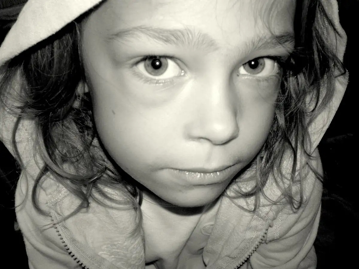
Frame 01When black and white works
Monochrome helps when color is a distraction: a cluttered background, clashing outfits, mixed light from a window and a lamp, or a newborn's blotchy skin in the first days. It also suits pictures that are mainly about emotion, such as a parent's hand on a baby's back or a grandparent laughing. Older faces with lines and texture look wonderful in black and white, which is one reason I often convert a few frames from portraits with grandparents. It works less well when the color is the point, as with autumn leaves, a sunset or a bright Mardi Gras costume like the ones in Mardi Gras and game day portraits.
Strong directional light makes the best black and white. Window light from one side, described in the guide to daylight, gives the shadows and highlights that monochrome depends on. Flat, shadowless light tends to turn into a muddy grey picture.
Frame 02Seeing in black and white while you shoot
Color is so loud that it's hard to judge a frame in grey tones by eye. One trick I like: set the camera's picture style or film simulation to monochrome while shooting raw. On most cameras the screen and electronic viewfinder then show a black and white preview, but the raw file still keeps all the color information, so nothing is lost. You start noticing where the light actually falls, and which outfits merge into the background once their color is gone.
Watch for tones that are different in color but the same in brightness. A red shirt against green leaves stands out in color, yet both may turn the same middle grey. In black and white, only brightness separates one thing from another.
Frame 03Which frames I convert from a session
I convert a handful of frames from each session, the ones where the gesture carries the picture, and I leave the color versions alongside so families can choose. The frames I reach for first:
- Close-ups of hands, feet and faces, where texture matters more than color
- Quiet moments between a parent and child, especially near a window
- Frames where outfits clash or a bright toy pulls the eye away from a face
- Pictures taken in mixed light that I can't make look right in color
- A newborn in the first week, when skin can be red, yellow or blotchy
A word on grain
A little grain added after conversion can make a black and white print feel more like film and hides small amounts of digital noise from high ISO frames. Keep it fine and light. Heavy grain shows up much more in a large print than on a phone screen, so I check it at print size before I send anything to the lab.
Frame 04Converting a color file, step by step
- Shoot in raw if your camera allows it. You keep all the color information to work with later.
- Finish the basic edit in color first: exposure, white balance and cropping. White balance still matters, because it changes how each color maps to grey.
- Convert using a black and white tool with color channel sliders, not a simple desaturate button. In Lightroom Classic this is the Black & White mix, which Adobe walks through in its black and white conversion tutorial; other editors have an equivalent.
- Lighten the red and orange channels a little to smooth skin. Darken blues to deepen a sky.
- Add contrast gradually, ideally with a gentle S-shaped tone curve, watching that whites still have detail and blacks are not crushed.
- Check the whole set side by side so the grey tones match from frame to frame.
- Look at the image small, as a thumbnail. If it reads clearly at that size, it will hold up as a print.
Frame 05What each color slider does to a portrait
| Slider | Move it up (lighter) | Move it down (darker) |
|---|---|---|
| Red and orange | Smoother, brighter skin; blemishes fade | Moodier skin, more texture; lips darken |
| Yellow | Brighter blond hair and sunlit grass | Deeper fields and golden backgrounds |
| Green | Lighter foliage, airy park backgrounds | Darker trees, so the face stands out |
| Blue and aqua | Pale sky, softer denim | Dramatic sky, darker jeans and blue eyes |
The moves that matter most for portraits are the reds and oranges, because those are where skin lives. Push them too far and skin goes chalky and featureless, with lips that disappear. I usually stop when skin looks bright but still has texture at full size.
Frame 06Selective color and why it dates
Selective color, sometimes called spot color, keeps one element in color, such as a red balloon or a baby's blue eyes, and turns the rest grey. It was very popular in portrait and wedding photography in the 2000s, when editing software made it easy. Today it tends to make a picture look its age, much as heavy vignettes or tilted horizons do.
There are exceptions. A natural version, where the scene itself is almost colorless except for one object, works well without any editing trick. If you want the effect, try finding it in the world first: a yellow raincoat on a grey day, a red door on a white wall.
I once took part in a monthly blog carousel with other photographers where the theme was natural spot color, and I still think of it on gloomy days. On dark, rainy days a single bright thing jumps out without anything being painted grey. Go looking for it on a wet afternoon and you will see what I mean.
Frame 07Sepia and toned prints
Warm brown or cool blue toning gives black and white a different mood. A light sepia tone suits older family settings, christening gowns and vintage clothing, which is why I sometimes offer it for christening and baptism portraits. A cool tone suits winter scenes. Keep toning subtle, since strong tints look like a filter. A split tone, warm in the highlights and slightly cool in the shadows, is another quiet option.
Ask your print lab whether a toned file will print neutral or tinted on their paper, because some labs apply their own corrections. For a truly neutral print, tell the lab the file is black and white; some print it differently to avoid a color cast.
Frame 08Black and white on the wall and in albums
Monochrome prints sit well together on a gallery wall, even when the original photos were taken years apart in different light. That makes them a good choice for a family wall that will grow over time. The guide to hanging prints and canvases covers sizes and placement, and the print size chart explains which crops suit which frames. In an album, mixing color and black and white spreads works well when you keep each double page to one or the other; I explain that layout in albums and photo books.
For quieter, intimate portraits of expectant mothers, I often choose black and white too; see window-lit bump portraits. Monochrome is also a common finish for author and business headshots, and more technique pages are collected in the technique library.